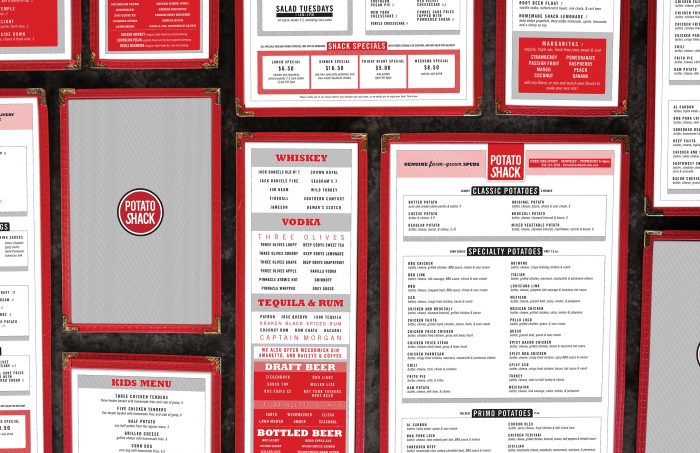
When Potato Shack embarked on a major renovation of their new location it provided the perfect opportunity to revise their entire visual identity. Previous additions to the building had created several unusual vertical planes which were employed as building signage locations, reducing the initial signage cost. Separate menus for primary offerings, kids, drinks, and to go items were developed to showcase the range of choices beyond potatoes, and utilize a strong color palette, matter of fact typography, and allow for quick revision and reproduction.
Recognized by: GDUSA